Why Stop and Learn the Layout?
When customers who are still very new to the Priority Matrix, I liked to invite them to “stop and take a look at the geography of the system.” This is an unusual term to apply to software. However, I feel that it offers a helpful perspective. Farmers inspect land down to the minerals in the soil before buying as much as one acre. History tells us that battles were won and lost based on how well an army could prepare for/adapt to the terrain. In Priority Matrix too, there are benefits to looking around and becoming comfortable with the layout before jumping in and building out your projects. I hope this step-by step visual representation of Priority Matrix’s layout will help give you a “feel for the terrain” as you start using the platform!
Moving From High-Level to Granular
You might not have noticed, but there is a concrete direction in Priority Matrix. As you move your eyes from left to right, you will first see high level, then increasingly granular information. The human eye naturally gravitates to the top left corner, so the logic behind this progression works in your favor. In effect, you make big-picture decisions on where to focus while your eye is initially glancing at the left side of the layout. After this, while moving your eyes to the right, you start taking in smaller details.
Priority Matrix Like a Large Window
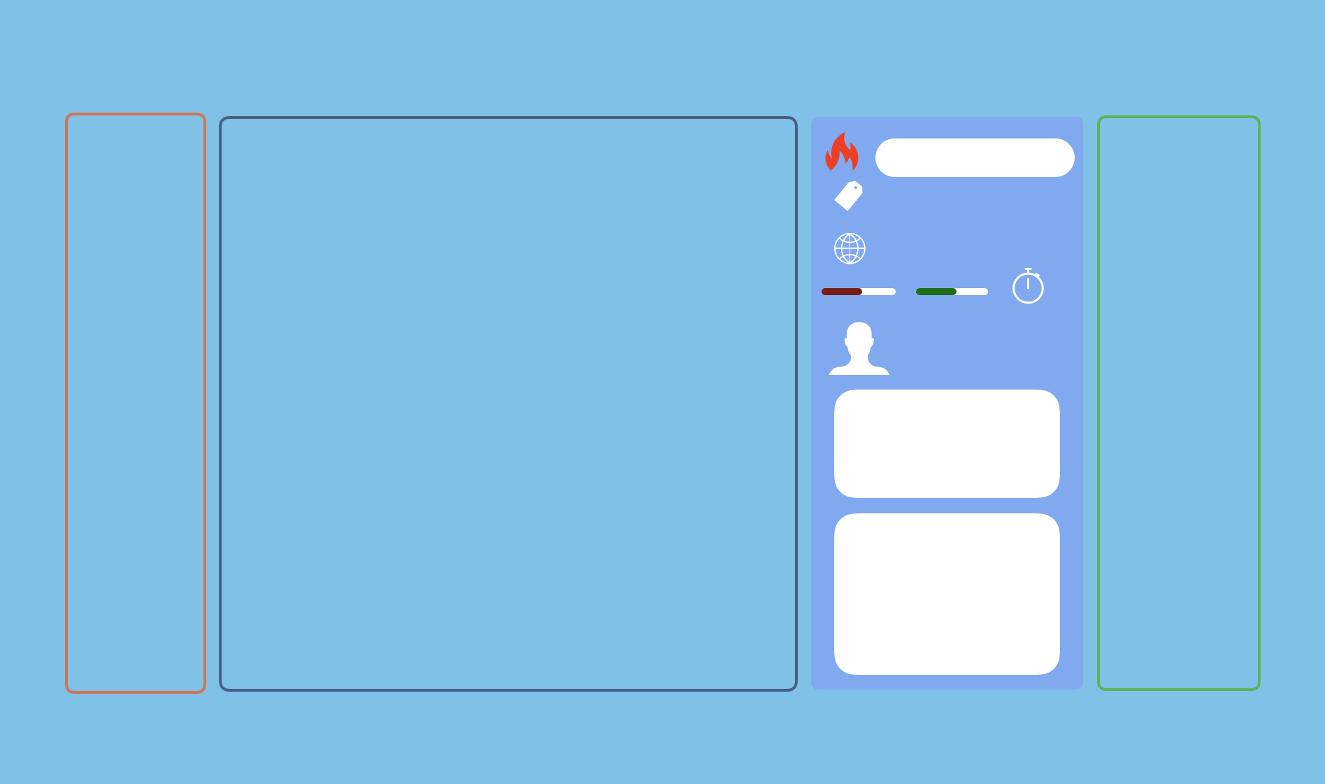
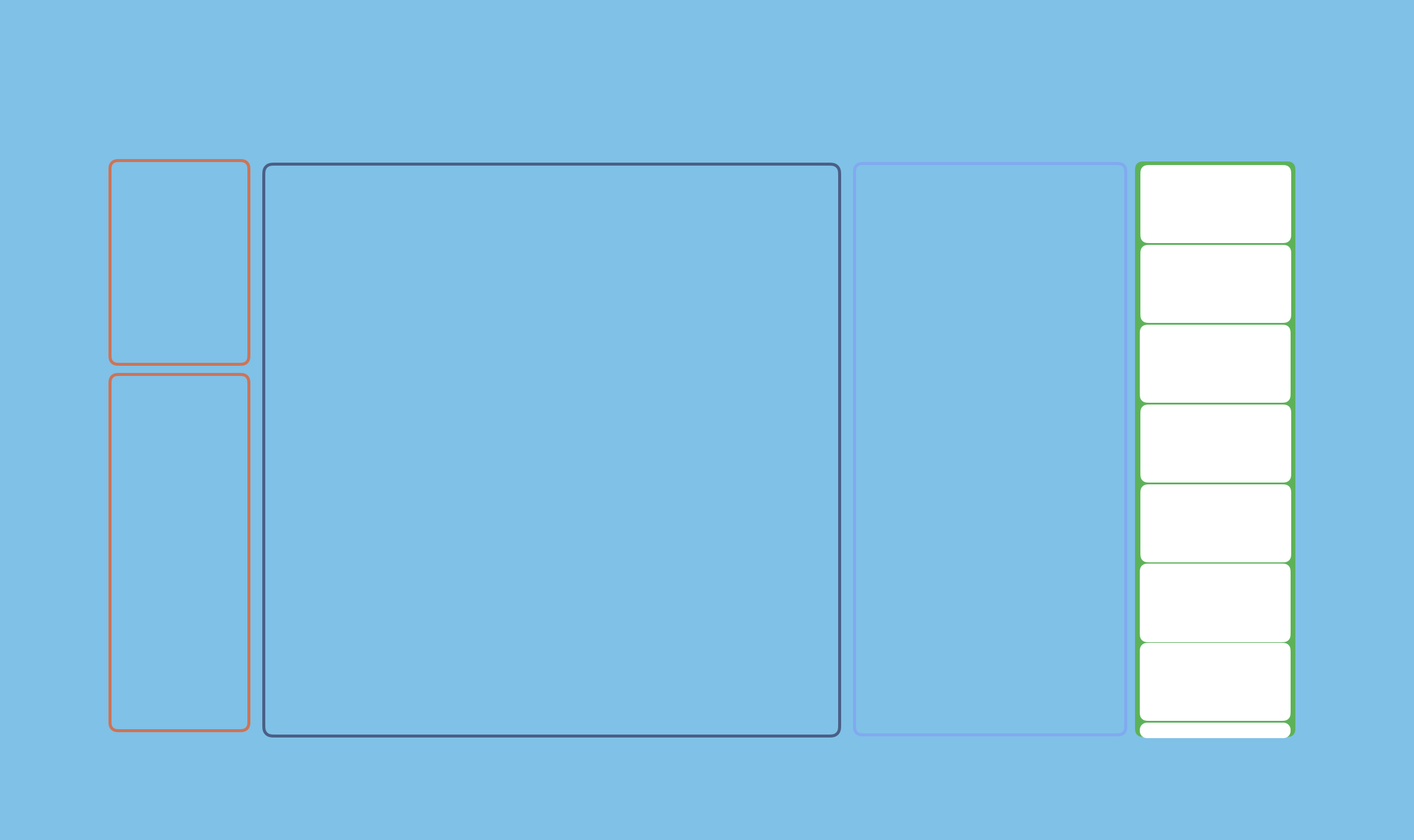
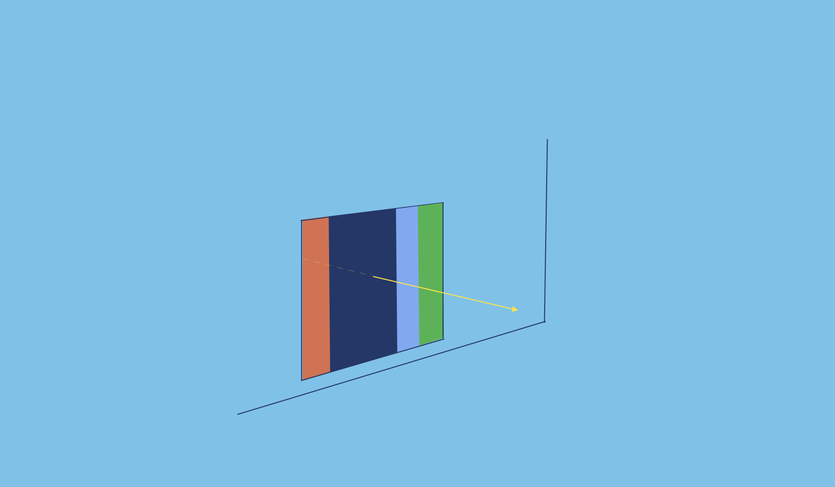 It can be helpful to think of Priority Matrix as a large window. This window has multiple panes running from top to bottom. Each pane, or panel, offers you a slightly different view. Like a window, Priority Matrix lets you decide exactly how much you want to see by opening and closing different panels and even filtering your view.
Exploring Priority Matrix’s Panels
 With a little added detail, the image above transforms from an abstract group of colored panels. Below, you should now be able to recognize an abstract of the Priority Matrix layout:
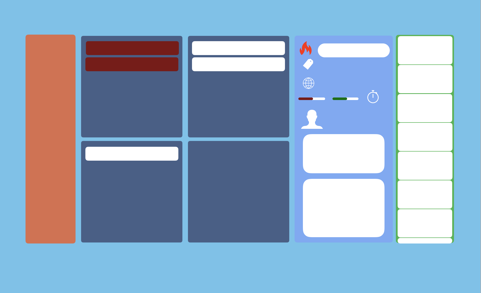 We are now going to address each of these ‘panels’ and what type of information it offers you.
High Level
 The panel to the far left of the dashboard provides you with access to everything you need to take stock of the big picture. This panel holds universal views and the project list.
High Level 1.0: Universal View
 By ‘Universal View’ we mean a view that compiles all data from all of your projects in Priority Matrix. There are three universal views to choose from:
In this area, you can also find the Home Screen, where you can quickly see what’s new, and Master List.
High Level 2.0: Project List
 Below the universal view area is the ‘Project List.’ Here you can scope out all the projects that you have access to, sort, and filter them. You can also create a new project to add to this list here.
The Center of Priority Matrix
 The ‘Central Window’ of the Priority Matrix dashboard is where you engage with the view or project you have selected.
Engaging With the Universal Views
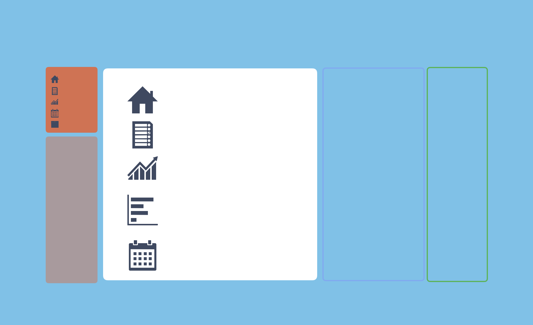
If you have selected the home screen, master list, or one of the universal views, this panel will show you that perspective.
Jumping Into a Project
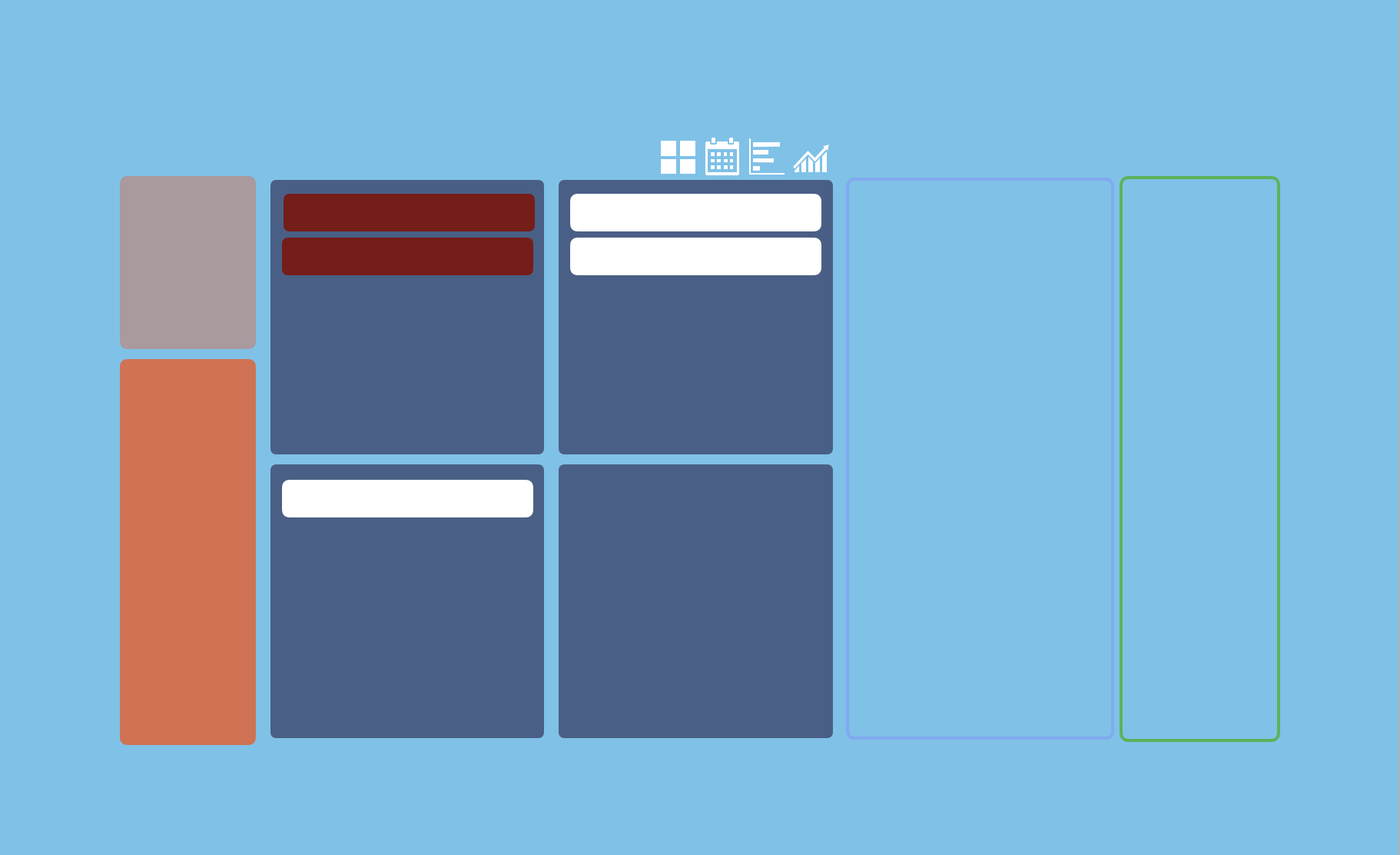
In contrast, if you select a project, this panel will open up it up for you to work in.
When you first open a project, show you the classic four quadrant ‘Matrix View.’ However, the buttons at the top right corner of this panel, allow you to move to the ‘Unique’ gantt, calendar or reports formats. This means you are still viewing only the data for one project at a time, even though this data is presented in a different format than the four quadrant view.
Details Panel
The ‘Details Panel’ to the right of the center panel shows you all the context that you need to work productively. This panel toggles back and forth between different levels of detail. If you select a particular item, the panel will show item specific context. An example of this is due date, owner or comments. If you have not selected an item, the details will show you project specific information like who access or the start and end date.
Feed
The feed offers a stream of time-stamped information, constantly updating in real time. This helps you keep an eye on activities across the board even if you are working in a focused or filtered view.
If you would like to spend more time becoming comfortable with our layout, you can also watch a five minute video on the subject:
